
"Basically, crash safety ratings are important to car buyers, and therefore essential for our website's overall experience."
First, let's understand what our goals for the project looked like:
Increased site traffic
Increase in the no. of organic clicks.
Increased conversions
A U2L of >4% should indicate high intent
Happy users
positive feedback and user satisfaction
I studied basic structure of the two crash safety reports that certify indian car's safety ratings: Global NCAP and Bharat NCAP.


Also we tried to understand these from the lens of the car buyer-what kind of information was needed by the user specifically, and what would be geeking out too much. These are people's responses

Here's what the users usually look for in safety, before the purchase decision.
Crash Ratings
Just the ratings, no analytical details.
Safety Equipment
Availability of ABS and airbags.
Strong Build
The physical strength of the car body.
… how might we build an engaging and satisying "safety ratings" page that provides all the necessary information clearly and transparently?
So I built a flow of information for the user, keeping the goal in mind..

Then built a wireframe

And, edited a few things, post-feedback


Right below the first fold, I added the key analysis, but also an influencer review widget that we have, to make the page more engaging.

Similarly added a section for each crash test video (parts of the bigger video), to make it more consumable.

Right below that I added the key safety feature widget, with a seperate widget for ADAS

and since the full design isn't live yet, here's the figma prototype to the final design ( the password is "heythere!!" )
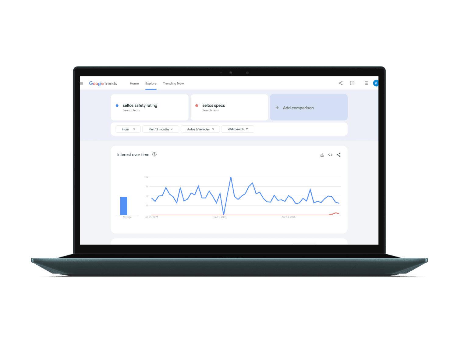
These are the results of this project, right now, without the full release. These are stats for keyword search data for 3 months, after release.

6.1% increase in clicks
5.7% of all clicks come from safety page.
Increased conversions
Recieved 300 leads (4.05% U2L)
Happy users
Only positive words in testing, 3.85% CTR